
Demand Destruction
Demand Destruction
In a deflationary world, growth is pure value
This week may have been short, but it was jam-packed with macro data, and we got several data points that were pointing to the exact same thing: deflation.
Plummeting PPI
The most direct deflation information came from Wednesday’s PPI reading, which showed that PPI once again is increasing at a decreasing rate.
For December, the YoY increase was 6.2%, coming in way below 6.8% expectations.
On a month-over-month basis, PPI was down -0.5% in December, which was also better (lower) than the -0.1% estimate.
Digging a little deeper, final demand foods were down -1.2% in December after a sharp 3.3% MoM increase in November. One month doesn’t make a trend here, but food inflation has been a major source of overall inflation for the past year, so this has at least the potential be another driver of deflation going forward.
But as we know, the main source of deflation over the past 6+ months has been the manufacturing/goods economy. I won’t go into all the details of goods deflation today, but I showed how deflation has been working its way up the supply chain here.
Now, we’re finally starting to see this reach final goods, which tracks the prices that we pay in stores, which is more reflective of CPI.
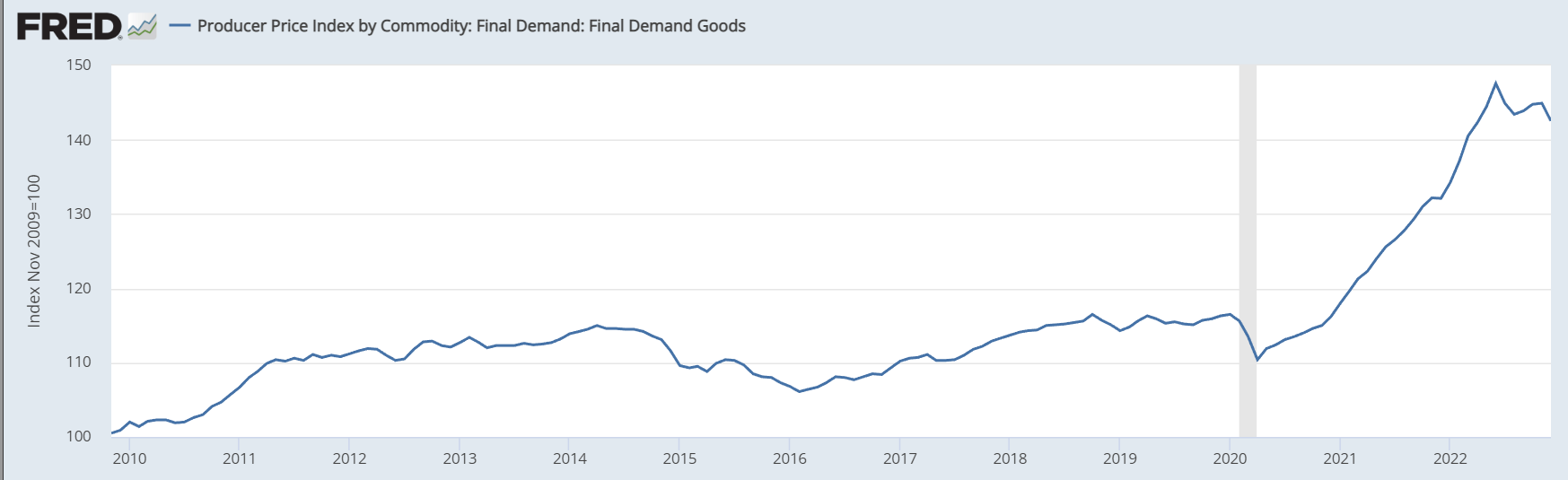
The final demand goods component of PPI was down -1.6% MoM in December, making it the 5th most deflationary month since 2010
As for services, we’re finally starting to see PPI roll over in that category as well
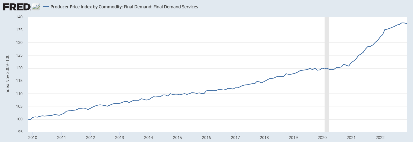
As you can see, the price of services is much more smoothed out than goods, which means it takes longer for deflation to actually take effect
It’s also by far the more important of the two when you’re looking at inflation data because it’s a much bigger part of PPI, CPI, and the overall economy.
So, we’ll need to see services begin moving down consistently before deflation is “official.”
But as I wrote last week, the market seems to be getting bored of inflation, so why is this still worth going over?
Because CPI and PPI are still good indicators of many other data points, two of which are manufacturing and retail sales
When you see deflation in goods, it means that supply is too high, demand is too low, or both. For a lot of goods, both of those things are currently happening at once, and it showed up in several data points this week, including the two I just mentioned: manufacturing and retail sales.
Manufacturing Cooling Off
Each month, the Federal Reserve regional banks post data on local business conditions. We can get a good idea of how the overall economy is doing by the contents of these reports.
We got two such releases this week: the New York Fed report came out on Monday, and the Philadelphia Fed report was released on Thursday.
These measurements weigh the number of positive vs negative responses to a bunch of questions about various data points, and wraps them all into a single data point. If there are more negative than positive answers, the index is negative, and vice versa.
For New York, it turns out things are almost absurdly negative. The forecast for January was -8.7, which already wasn’t great, but the actual number was far worse at -32.9; that’s the 5th lowest reading in over 20 years.
Unlike the Philadelphia Fed, the New York Fed doesn’t post a nice table that lays everything out, but you can find all the data I’m about to reference here.
Overall, only 11.3% of surveyed businesses reported that conditions had improved in January, which is less than half of the 23.1% from December.
Here are some of the biggest contributing factors:
New orders: 15.5% of business reported improving conditions, compared to 46.6% reporting declining conditions
Shipments: 20.7% of business reported improving conditions, compared to 43.2% reporting declining conditions
Unfilled orders: 14.3% of business reported more unfilled orders, compared to 28.6% reporting fewer
The obvious conclusion here is that demand is way down; hardly any orders are coming in, which drags shipments down, and means there are fewer unfilled orders.
Now, let’s have a look at Philadelphia’s report:
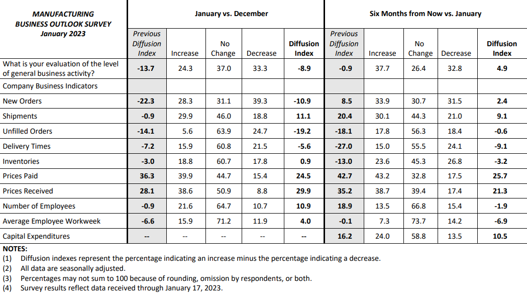
Overall, Philadelphia isn’t in as much of a slump as New York, coming in at -8.9 for the month of January.
Unsurprisingly, the weakness came from the same three areas: new orders, shipments, and unfilled orders.
Considering that this was the primary source of weakness, it was interesting to see inventories up for both reports: New York was up 4.5 and Philadelphia was up 0.9. These are small increases, but it shows that even though many companies are drastically slowing their addition to inventories, it’s still slower than they can sell them. That’s the supply side of the equation. Higher supply + lower demand is a recipe for extreme deflation.
Ugly Retail Sales
Now that we’ve seen evidence that demand for goods from businesses is essentially on life support, we can take it a step further and say demand from businesses is down because demand from consumer is down. We’ve seen slight evidence of this for about a year, but the past couple months have painted a much clearer picture.
In December, retail sales were down -1.1% MoM after falling -0.6% in November, signaling that demand from consumers is finally starting to roll over.
If you look at the past 3 years, retail sales have gone parabolic, shooting up by about $140 billion, which is an increase of 30%. If you divide that $140 billion by the ~264 million working-age population, you’ll see that on average, people have spent an extra $530 spent per person. That doesn’t sound like a lot, but it adds up when you scale it over the entire economy.
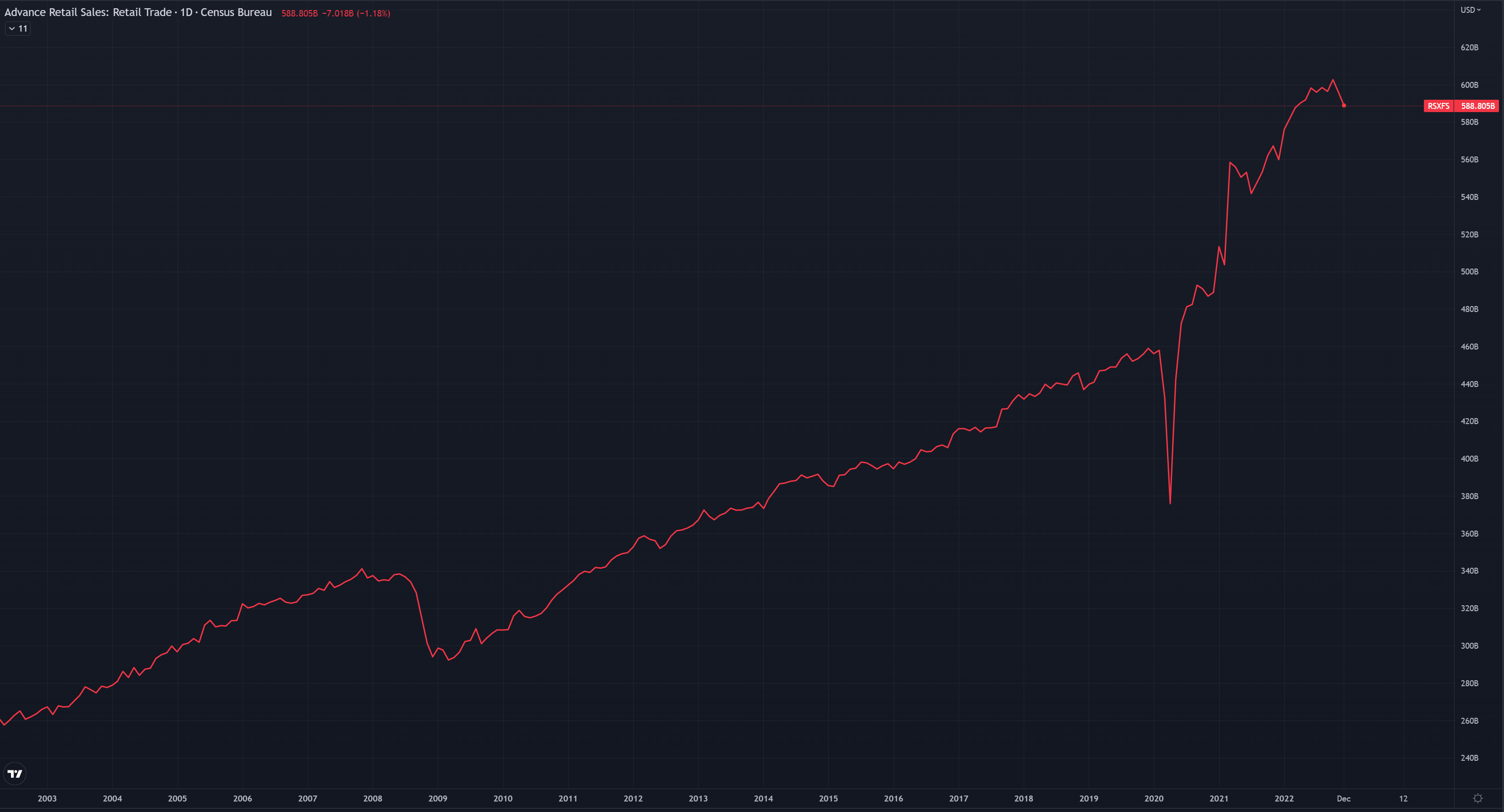
Source: TradingView
There are two likely reasons for this. First, it seems likely that the increase in spending was due to stimulus checks. After that, inflation took over and people had no choice but to spend more.
The stimulus period also created a “wealth effect,” where markets were up and people were getting literal free money, so spending appetite increased, and it takes a long time for that to die down.
So long, in fact, that despite savings growing extremely thin, people continue to spend the same amount or more via credit cards. As a result, the depletion of savings and increase in consumer debt has been an extreme trend over the past year.
The most recent data that we have is from November, and during that month, total revolving consumer debt was 2.58x higher than total personal savings. This a stark contrast to November 2021, when the ratio was only 0.79x, meaning that savings actually was in excess of revolving consumer debt.
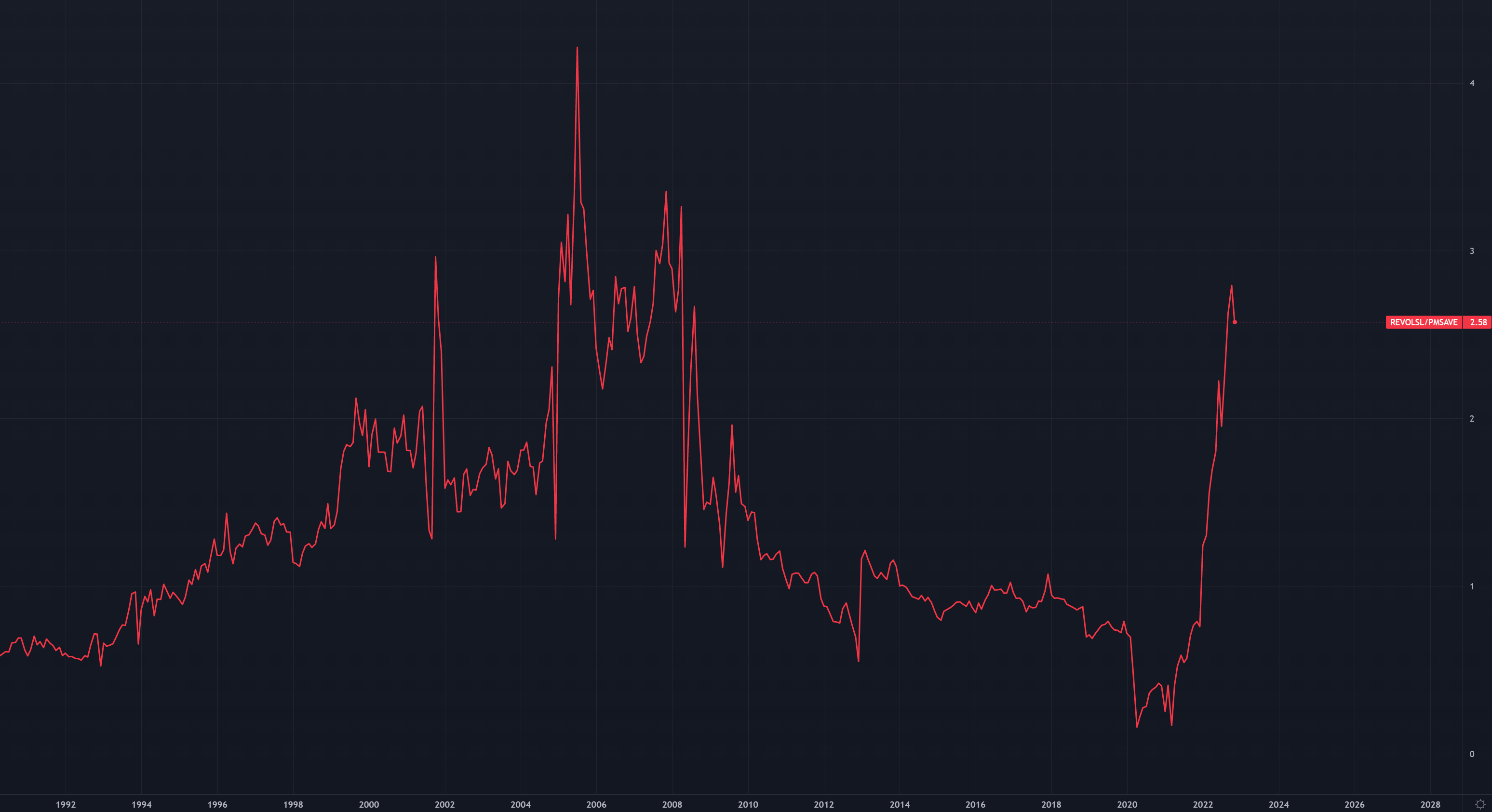
Source: TradingView
This ratio hasn’t been this high since 2009, and clearly that’s not a sustainable move. As I’ve said before, the only reason people are still continuing to spend as much as they are is because of the strong jobs market. Now that we’re seeing layoffs begin to happen more consistently and at bigger companies, I believe the market is quietly starting to focus more on jobs data and gradually less about inflation. If layoffs become more prominent, a lot of spending will dry up in a very short period of time, which clearly wouldn’t be good for earnings.
Speaking of earnings, this can all be tied to earnings season as well, which will be in full force over the next 2 weeks.
Earnings Picture
If we start to see widespread deflation, we’ll see that reflected in lower $ figured for corporate sales and profits; in other words, deflation will eventually create an earnings recession.
As YoY comps go negative, companies that sell goods (electronics, automobiles, household appliances/furniture, clothing, etc.) will have to sell more units of the same things in order to “grow” their sales figures. That probably won’t be much of a factor in the upcoming Q4 2022 earnings, but it’ll become increasingly relevant each quarter in 2023, and we’ll get a closer look at companies report Q1 guidance.
As companies weigh in on guidance, analysts will of course change their estimates accordingly. This is one of the best lagging indicators I’ve seen, and we can use it to our advantage.
This picture is a bit old, but it shows the change in analyst estimates over the next year vs the price of the S&P 500 from 2000 to 2020.
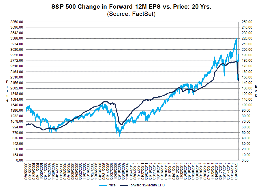
As you can see, the market tends to bottom as estimates first begin to come down. That’s because, as it turns out, analyst estimates are extremely unreliable, and tend to focus on the past rather than the future. Nobody on Wall Street wants to be out of consensus, because if you’re out of consensus and wrong, you’re fired. So, everyone gives a safe estimate that’s not necessarily taking leading macro conditions into account.
If we look at the current estimates for 2023, we can see that they have yet to fall meaningfully. However, the signs are there for it to happen, considering leading indicators have been falling fast and we’re now seeing coincident indicators like retail sales and manufacturing show definitive weakness.

The big question mark is: how/when will markets react? Macro trends may be relatively predictable, but markets aren’t, so in the short term anything can happen. If we’re looking at a deflationary future, I would assume that over the mid/long term, it’ll make quality growth stocks stand out even more. That’s because while many companies are facing shrinking sales and earnings due to falling prices, the companies that are actually seeing growth in customer base and sales will be extremely attractive to investors. That, of course, fits in line with innovation, where you’re solving problems and creating efficiencies that people want. As a reminder, I gave 21 investments that I believe will thrive in the long run here.
In the short term, of course, anything is possible. We’ll know a lot more a few weeks from now after most of the major companies have reported Q4 earnings and given their Q1 outlooks, and I’ll be here to fill you in on lots of relevant information.
Hey Ian... Is there a way that we can look at the portfolio to see the current open/sold positions? If there is I can't seem to find it. Sometimes I don't see the trade alerts in real time and potentially loose track. It would be easier to look at a document here rather than search my emails. Thanks